
Making affordable healthcare more approachable.
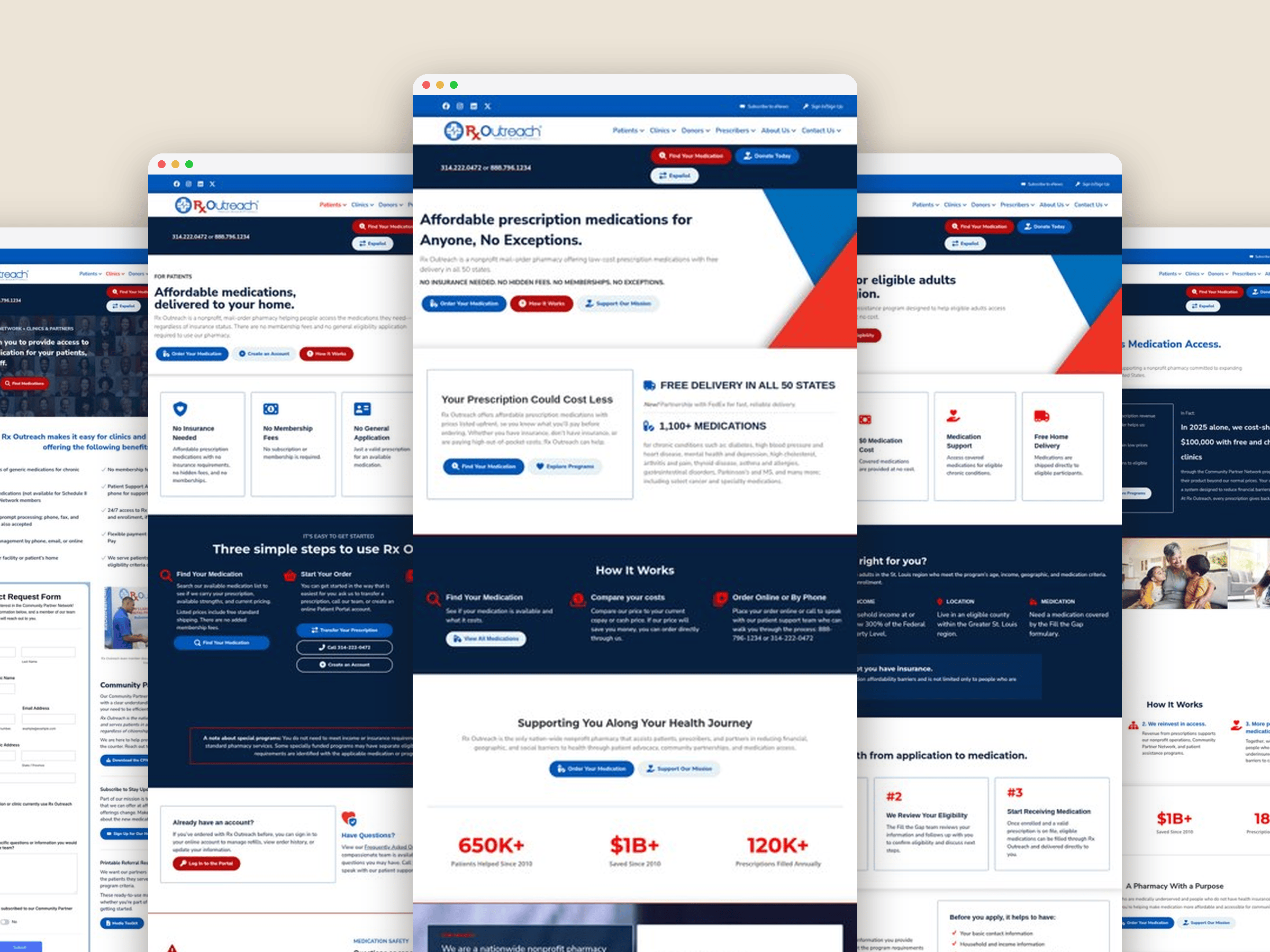
Rx Outreach is a nonprofit pharmacy that helps people access affordable prescription medications. My work focused on refreshing the website’s visual experience, creating clearer content layouts and bringing greater consistency to the brand across digital and print materials. Desktop + mobile project mockup

The Project
THE CLIENT
Rx Outreach
PROJECT ROLE(S)
UI/UX & Visual Design
PLATFORMS USED
Adobe Creative Suite, WordPress, Beaver Builder
THE CHALLENGE
Make complex healthcare information easier to understand while creating a more consistent, approachable experience across web and print.
Important information deserves a clearer experience.
For people looking for affordable prescription medications, finding reliable information should feel straightforward, not like another obstacle to overcome.
Rx Outreach serves individuals navigating healthcare costs and medication needs, as well as professionals helping patients access its services. The organization’s website and communications needed to present information clearly while feeling approachable and consistent.
The opportunity was to improve the front-facing experience without losing the familiarity of an established nonprofit brand.
Clarity
Make important information easier to scan and understand.
Consistency
Create a more unified visual experience across digital and print.
Practicality
Focus on improvements that fit the organization’s resources and existing systems.


The Web Experience
Making information easier to understand.
I refreshed page layouts, improved visual hierarchy and introduced more consistent design patterns to make Rx Outreach’s website clearer and more approachable, without starting from scratch.
Brand & Print Design
One mission. A more connected visual identity.
From brochures and rack cards to patient-facing posters, I helped bring greater consistency to Rx Outreach’s communications through thoughtful typography, layout and visual design.
Each piece needed to feel like part of the same brand while making important information easy to understand

The Outcome
Thoughtful changes and a more cohesive experience.
The work brought a more consistent visual approach to the website and supporting print materials, improving how information was presented without requiring a complete redesign.
By building on the existing brand, we created practical improvements that worked within the organization’s resources
Let’s Go Back
View More Projects


View More Projects

Let's connect a few dots.
The best ideas usually start with a conversation, a little curiosity, and a willingness to explore what’s possible. I’d love to hear what you’re working on.